


For the V&A’s Europe 1600–1815 wing, we designed a graphic identity and interpretation system.
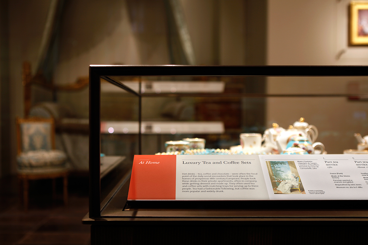
We developed a colour coding system for each of the seven rooms that suit the objects displayed and relate to the wall colours of each room. The primary font is a specific cut of Baskerville that we selected because it had two versions ideal for small type and display type. The secondary font is the V&A Sans font, that we were required to use. The panels, caption labels, large print label books, gallery books and facsimile books have a luxury tactile finishing so it sits well within the time period of this gallery.
Whilst the Europe wing was being re-developed we designed the hoardings to promote the galleries providing glimpses of some of the objects that will be displayed.
Project completed at Why Not Associates.
© 2016 Shaheena Pooloo Limited