

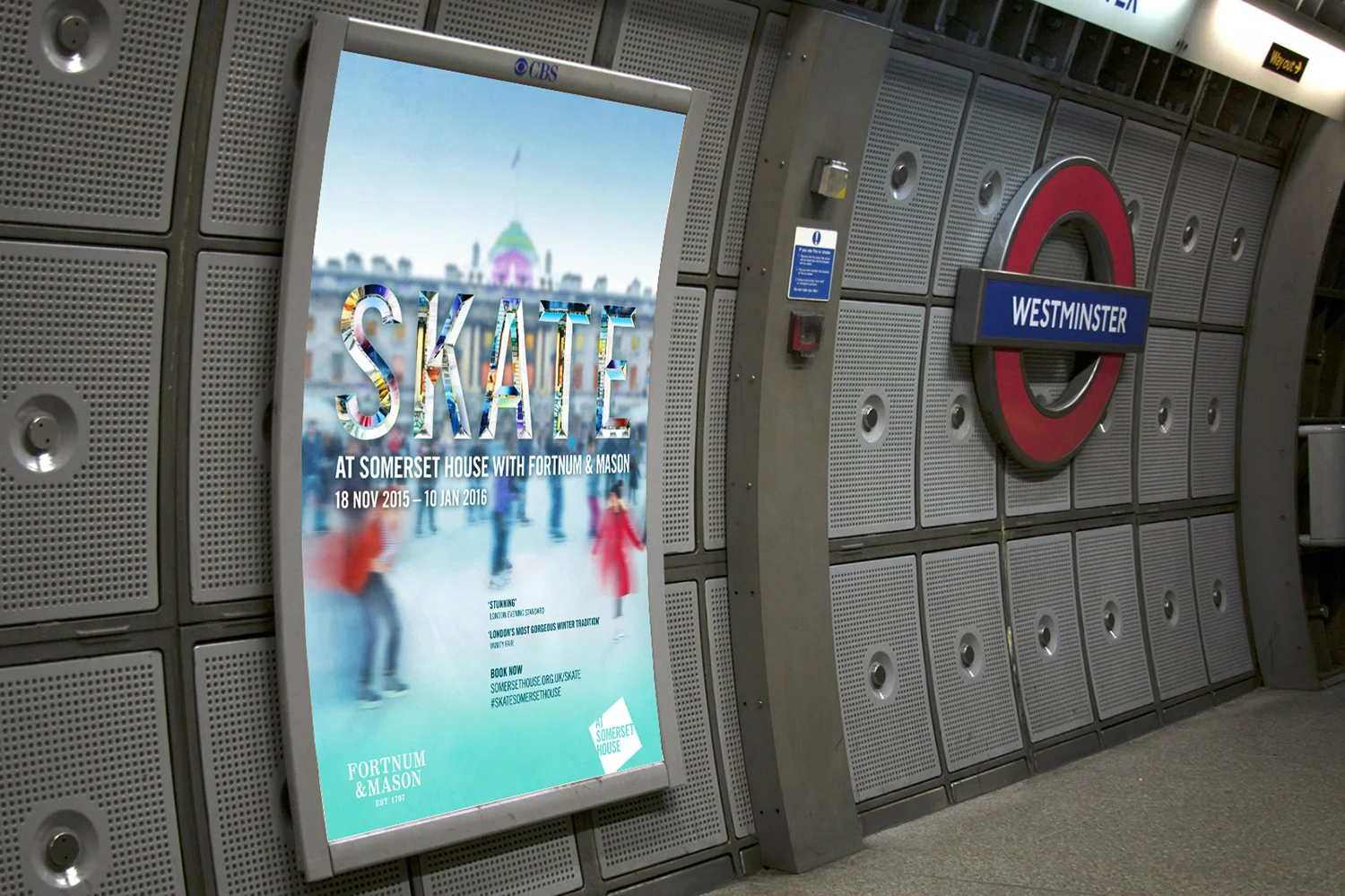
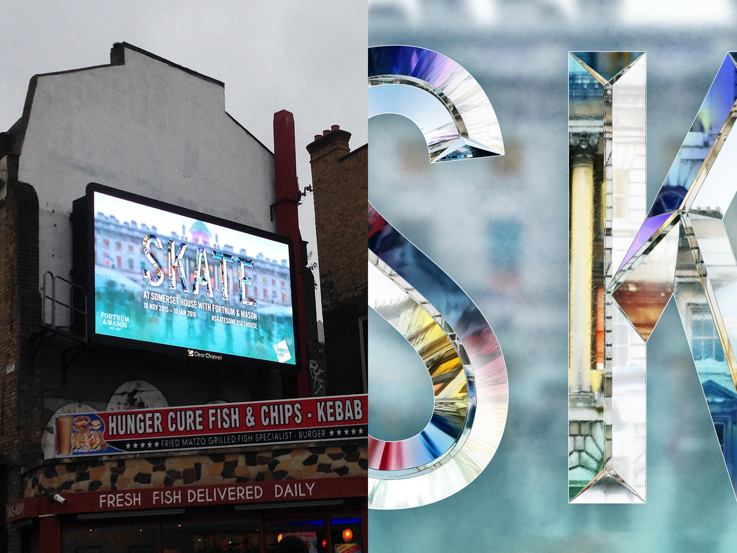


Skate at Somerset House has a reputation as London’s most glamorous ice rink.
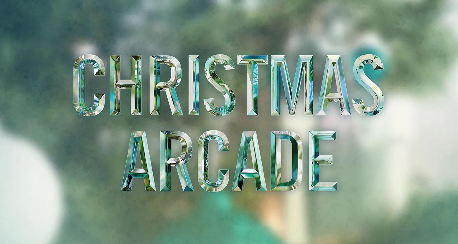
We created a new typographic identity for Skate 2015’s event with Fortnum & Mason, by creating the word ‘SKATE’ in engraved cut glass. This concept was applied to other elements within Skate such as the Christmas Arcade, The Winter Party and signage for the event. By making the type out of glass we could then change the background image creating a flexible system and consistency in the branding along with the colouration.
Project completed at Why Not Associates.
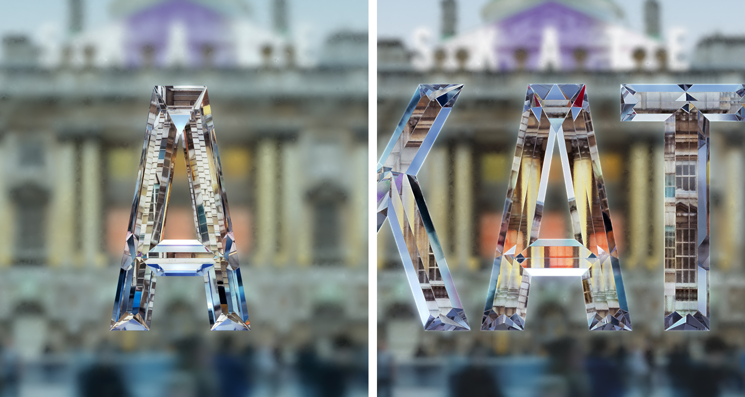
Development visual for glass lettering
© 2016 Shaheena Pooloo Limited